Iconography

Design

When drawing or compositing investing-centered icons, consider the subject matter and any established visual conventions; the icon’s metaphor should feel clear and intuitive to most users. The fundamentals outlined in this section can also guide other types of illustration.
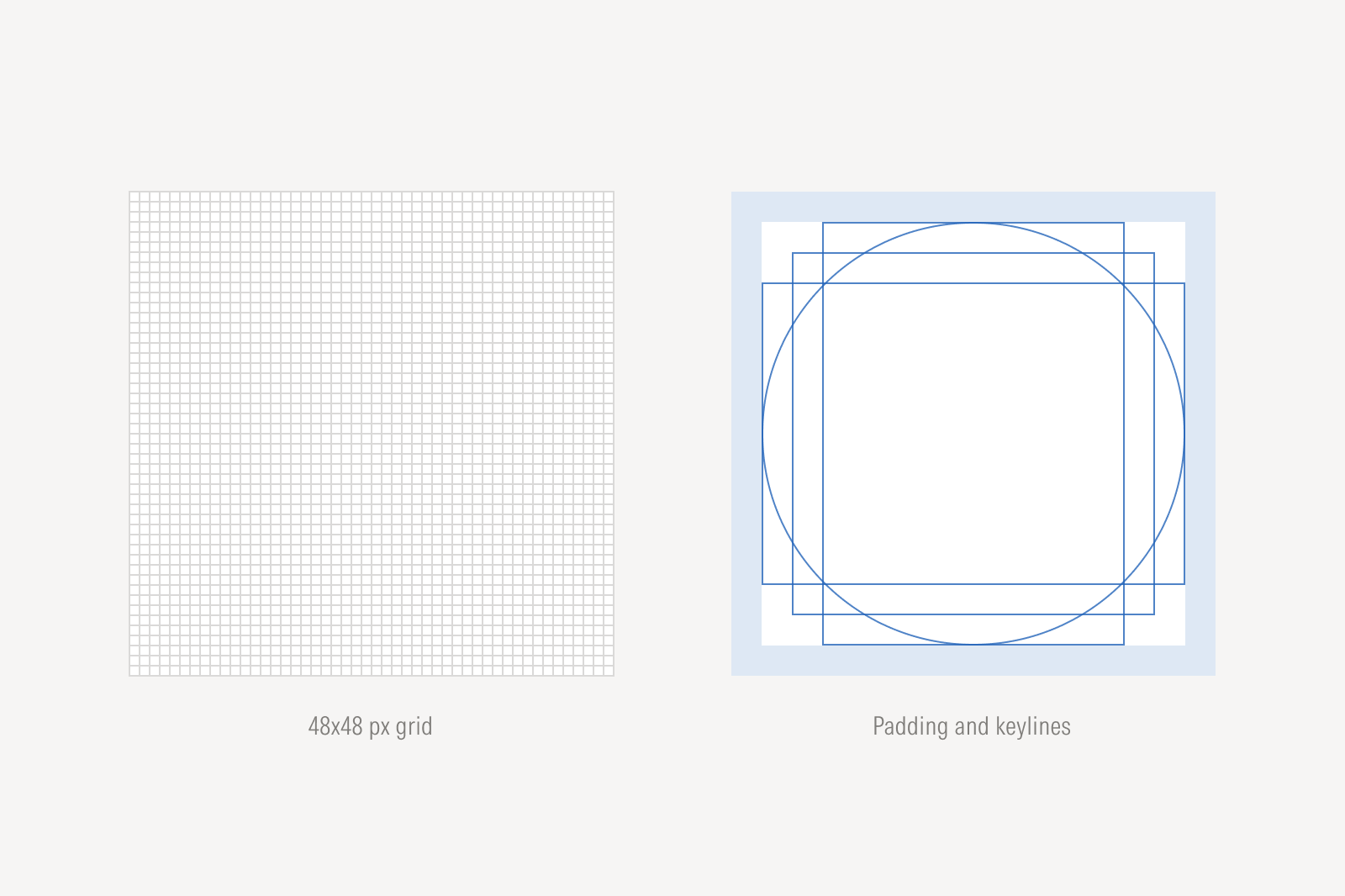
Construction

Icon grid frame, padding, and overlapping circle, square, and rectangle keylines centered within the grid.
Icons are drawn on a 48×48 px grid frame that is further subdivided into gridlines 1 px apart. Keylines indicate the recommended shape, position, and size of the artwork within the grid frame for optimal optical balance.

Padding

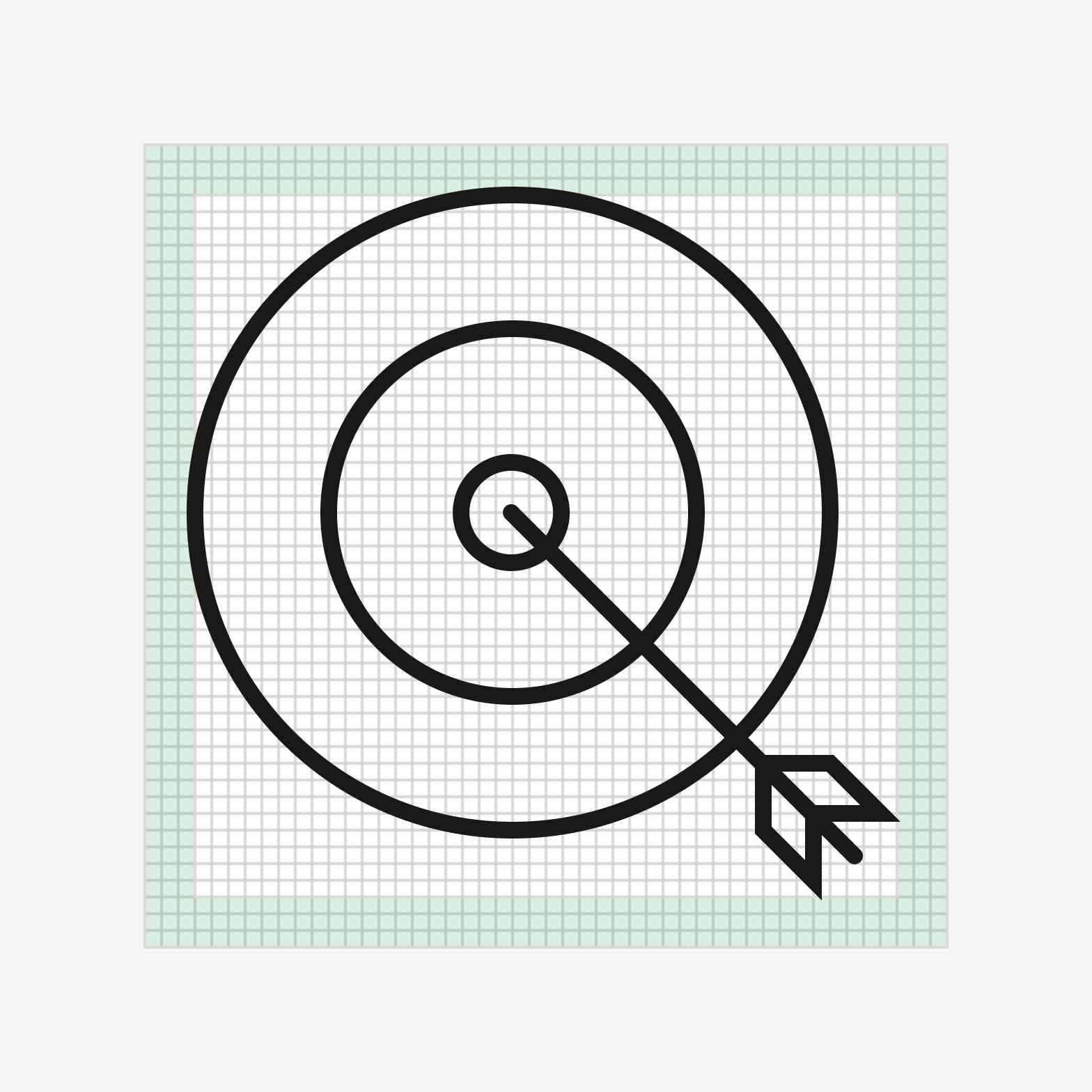
Target icon with arrow, contained fully within the padding boundary.

Do keep artwork within the padding area, typically 3 px.
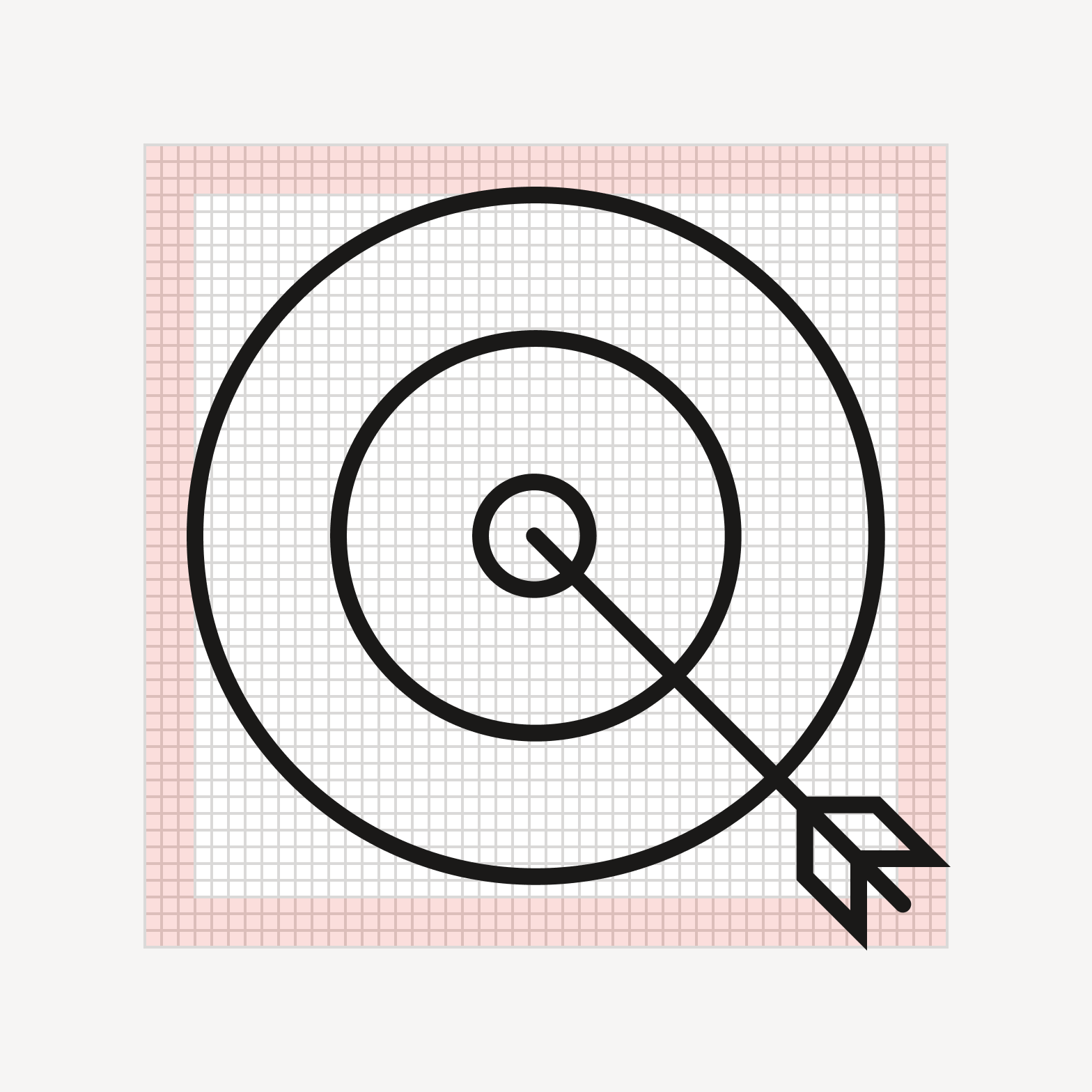
Target icon with arrow, its tail extending past the padding boundary into the margin.

Avoid allowing the artwork to encroach on the padding area.

Keylines
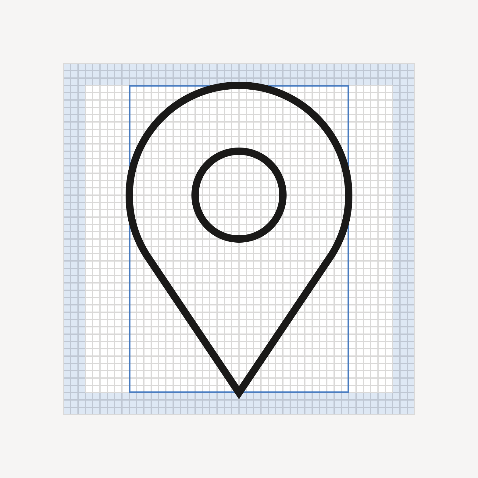
Location pin icon, its top and bottom tips extending beyond the keyline into the padding area.
Tall icons may extend into the padding area for better optical balance.
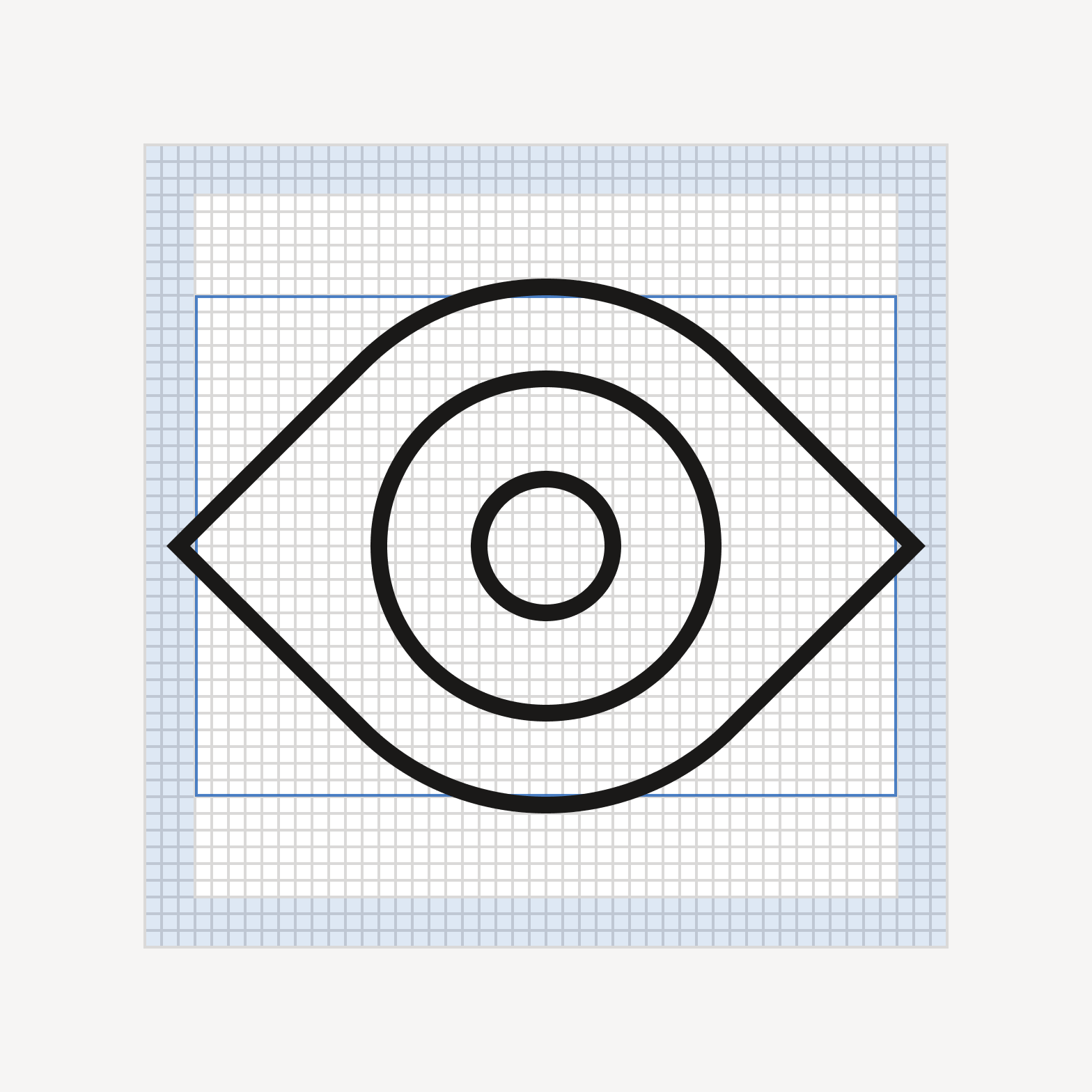
Eye icon, its left and right points extending beyond the keyline into the padding area.
Wide icons may extend into the padding area for better optical balance.
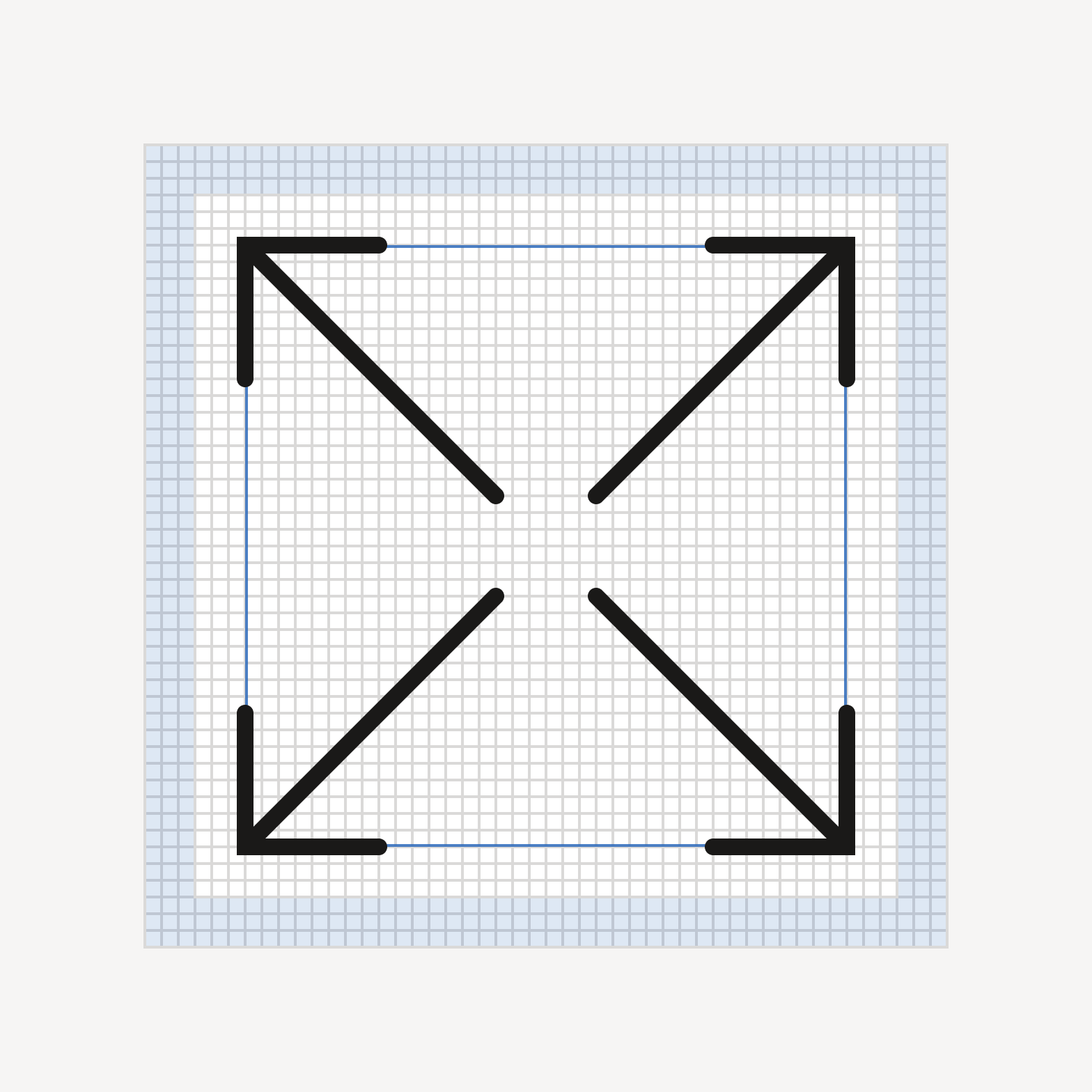
Expand icon of four diagonal arrows, fitting neatly within the keyline square.
Square icons tend to sit neatly within the keyline and padding.
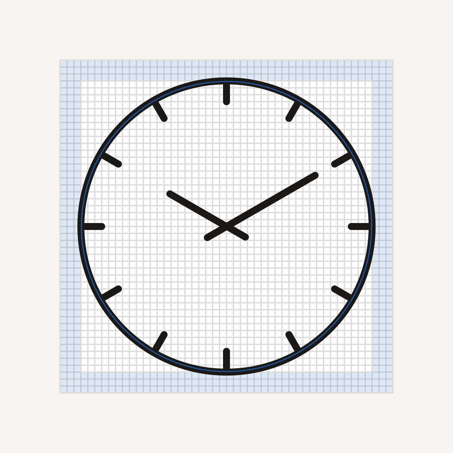
Clock icon, fitting neatly within the keyline circle.
Circular icons tend to sit neatly within the keyline and padding.

Stroke

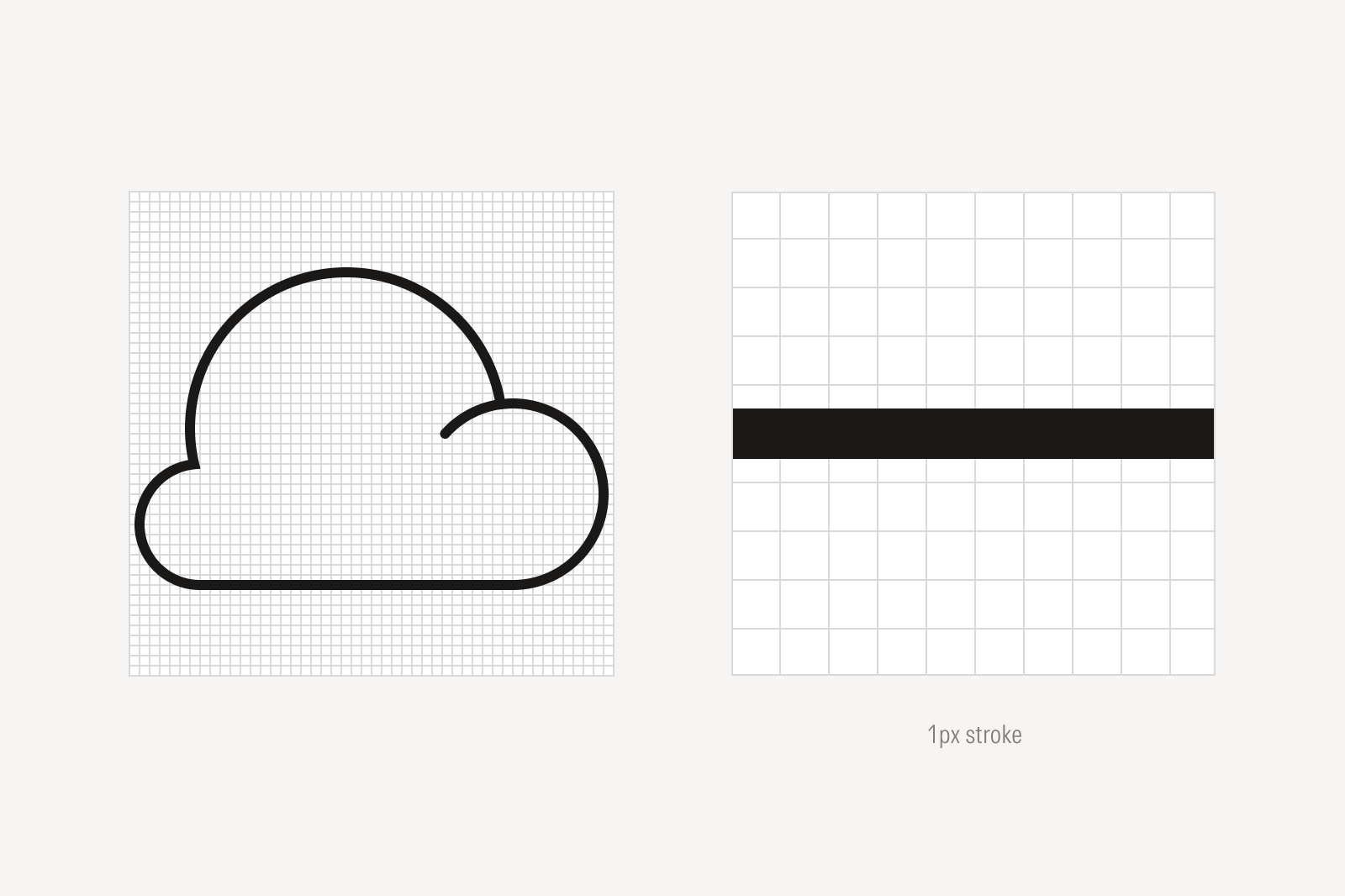
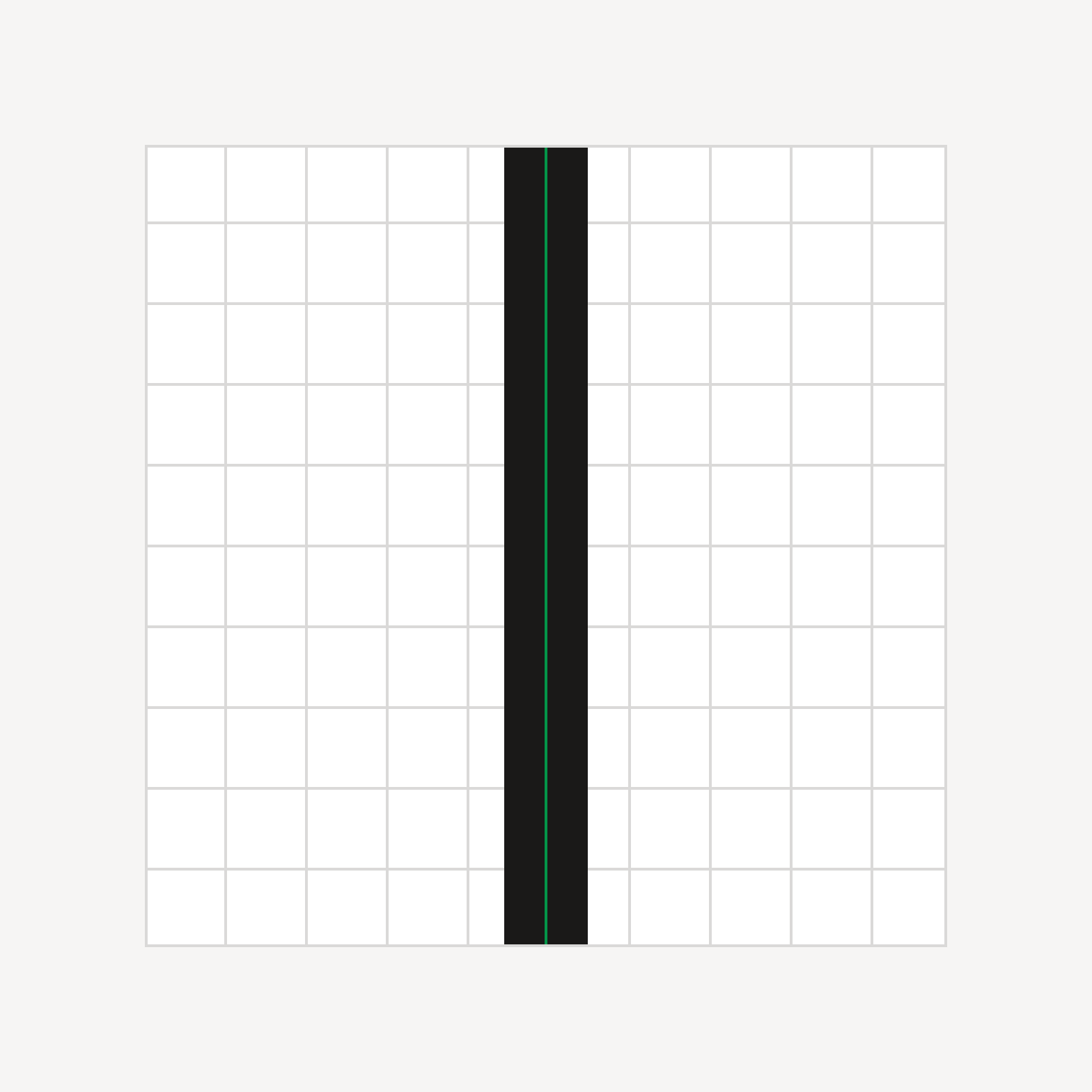
Stroke aligned to the grid.
Cloud icon with close up of 1 pixel stroke.
Stroke aligned to the grid.

Do align strokes to the grid.

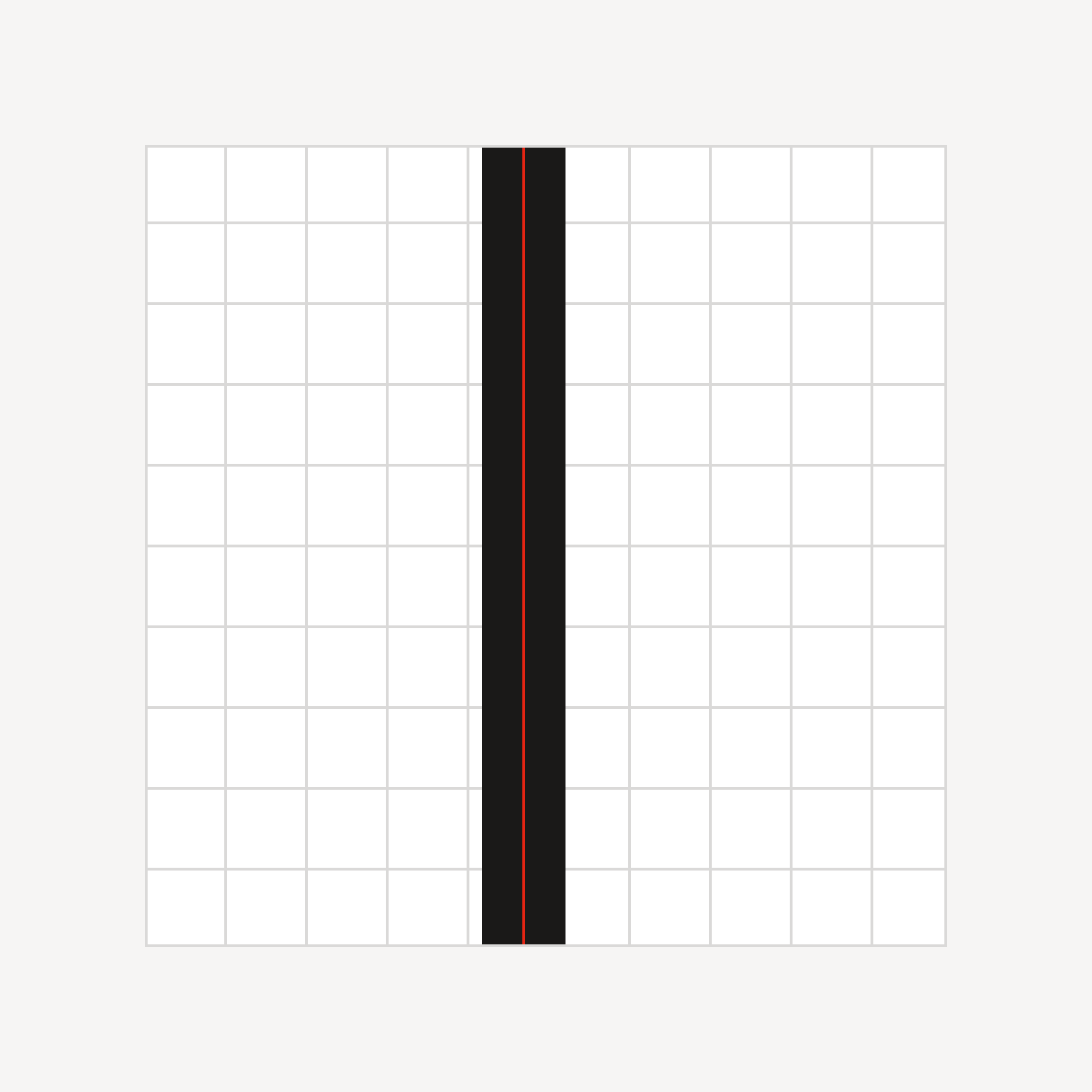
Stroke not aligned to grid.

Don’t draw lines in between gridlines.

Alignment
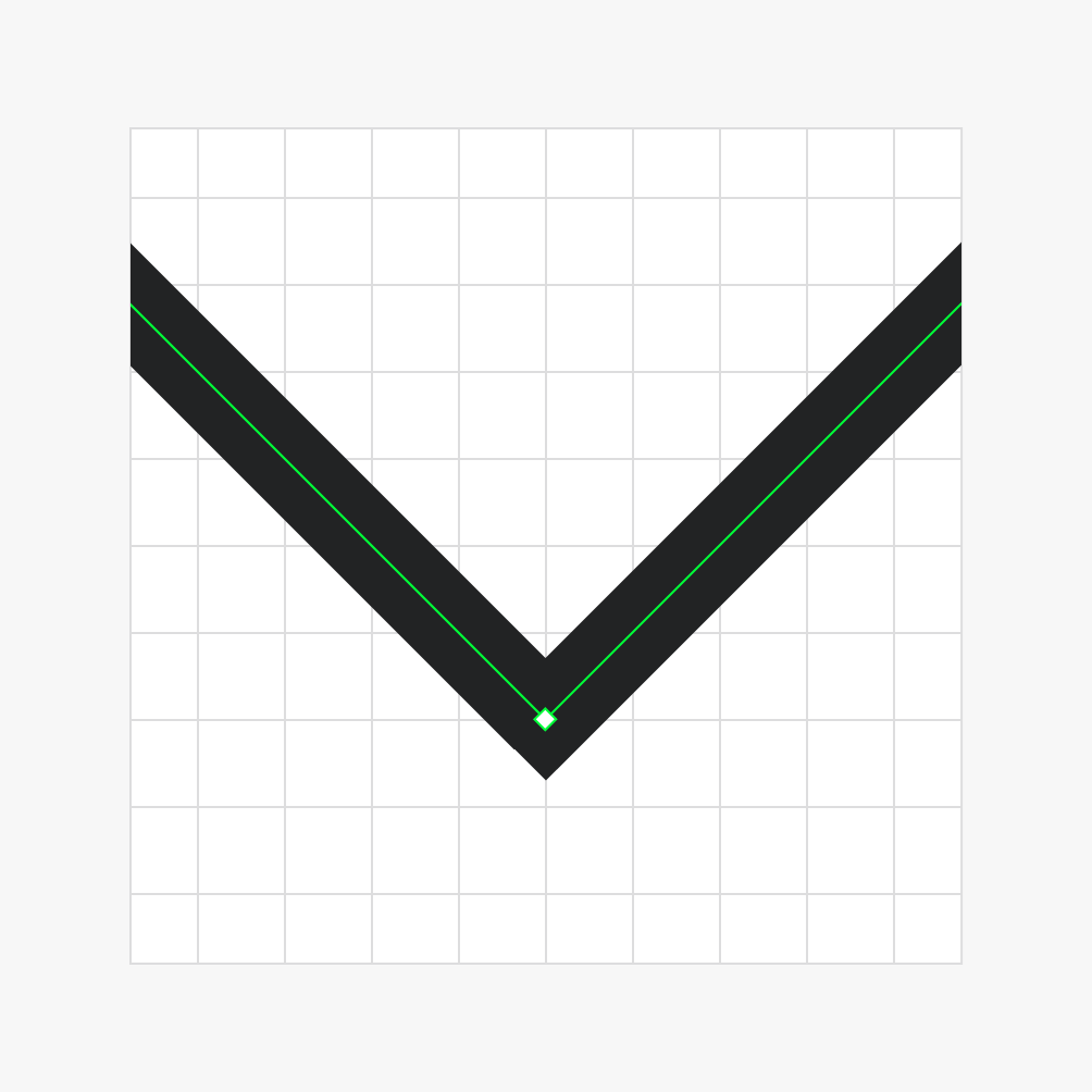
Vertices aligned to grid.

Do ensure vertices align to the grid.
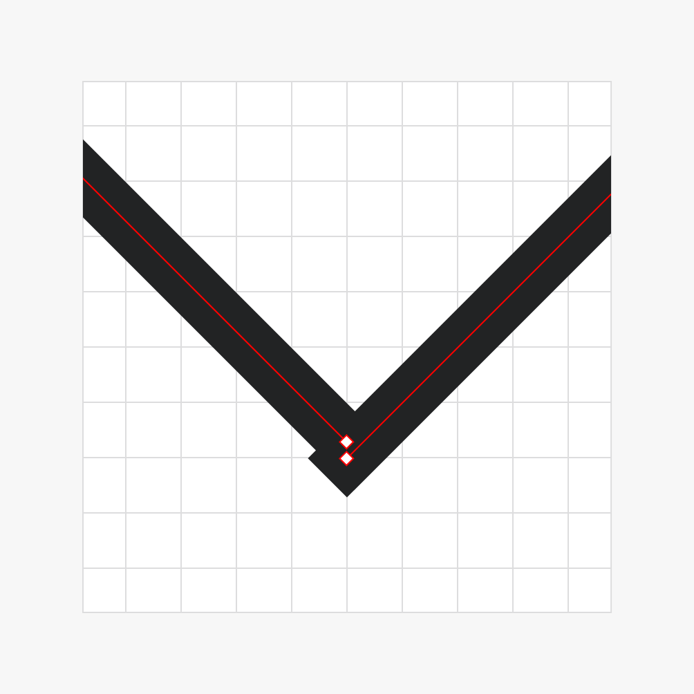
Vertices not aligned to grid.

Avoid placing vertices off the grid.

Do scale the icon and stroke weight proportionally.

Don’t maintain the stroke weight when scaling the icon.
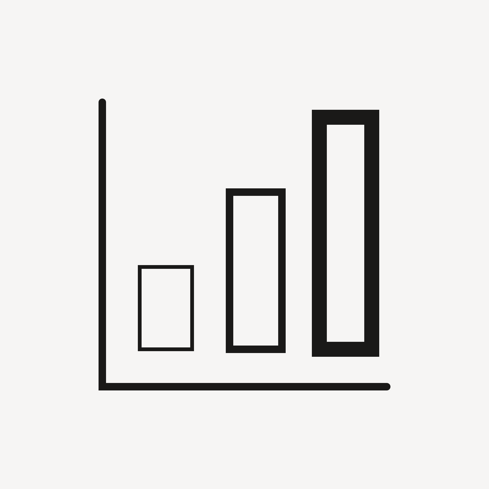
Icon with different stroke weights.

Don’t mix different stroke weights within the same icon.

End Points
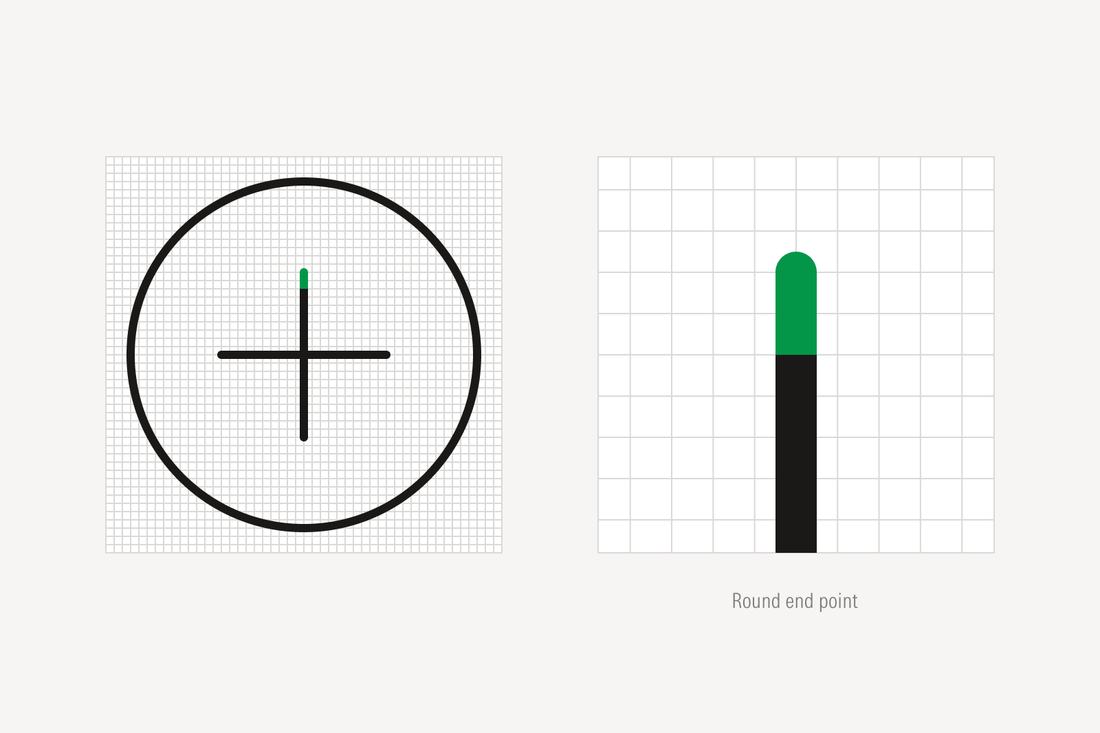
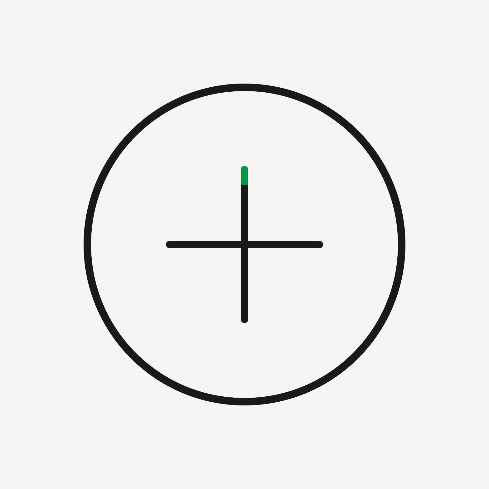
A plus icon inside a circle on a grid, with the top of the vertical stroke highlighted in green; and a close-up labeled 'Round end point' showing that stroke tip as a rounded green cap above a straight black line.
Icons are drawn with round end point strokes.
Icon with round end point.

Do use round end points.

Icon with square end point.

Don’t use square end points.

Breaks

Icon with joined lines.

Do join all lines in the icon.

Icon with line breaks.

Avoid decorative line breaks unless they help clarify the idea of an object.
Corners

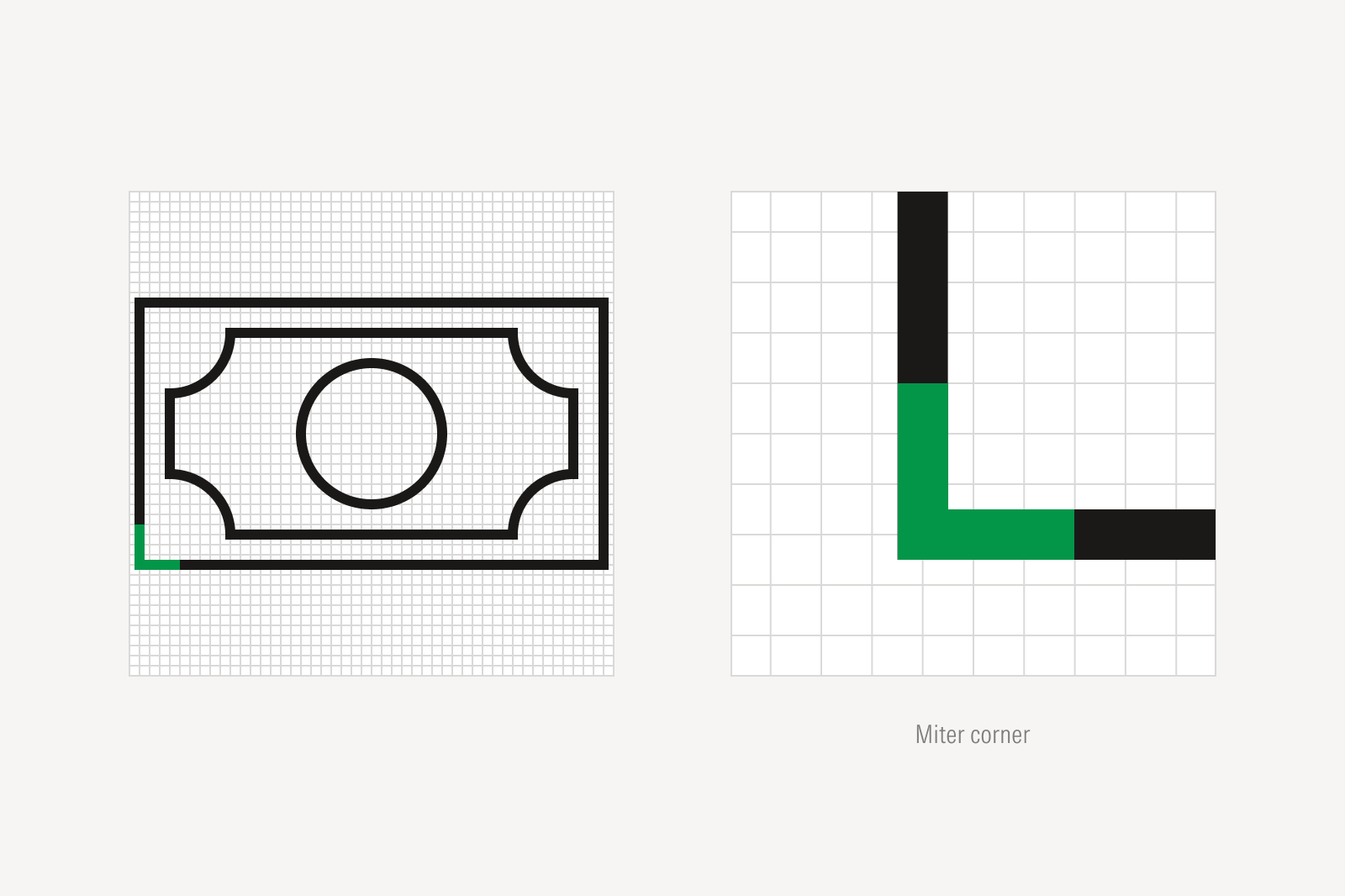
A banknote icon with a circle in the center, drawn on a grid with its bottom-left corner highlighted in green; and a close-up labeled 'Miter corner' showing that corner as a sharp right angle where two green-highlighted straight edges meet.
As a general rule, icons are drawn with miter corners.
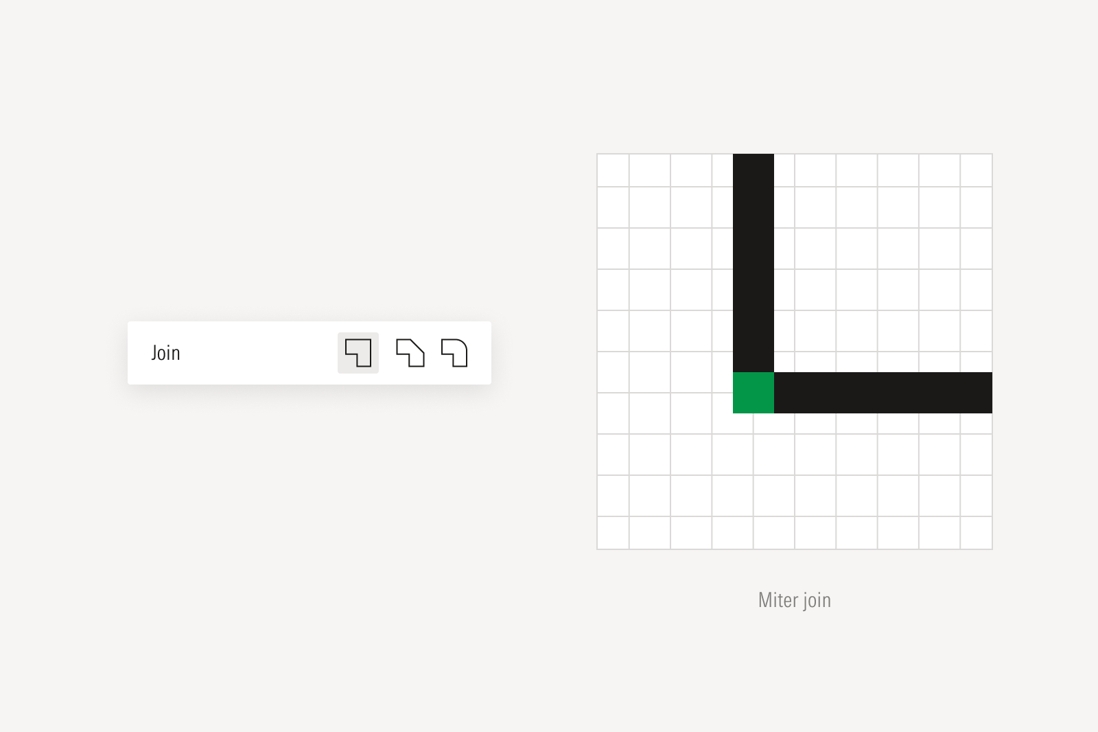
Two elements: a design software 'Join' control with three corner-style buttons — a sharp miter corner icon (selected), a rounded corner icon, and a beveled corner icon; and a close-up grid diagram labeled 'Miter join' showing a right-angle corner with its joint point highlighted in green.
Select miter joins in your chosen design software.

Materiality

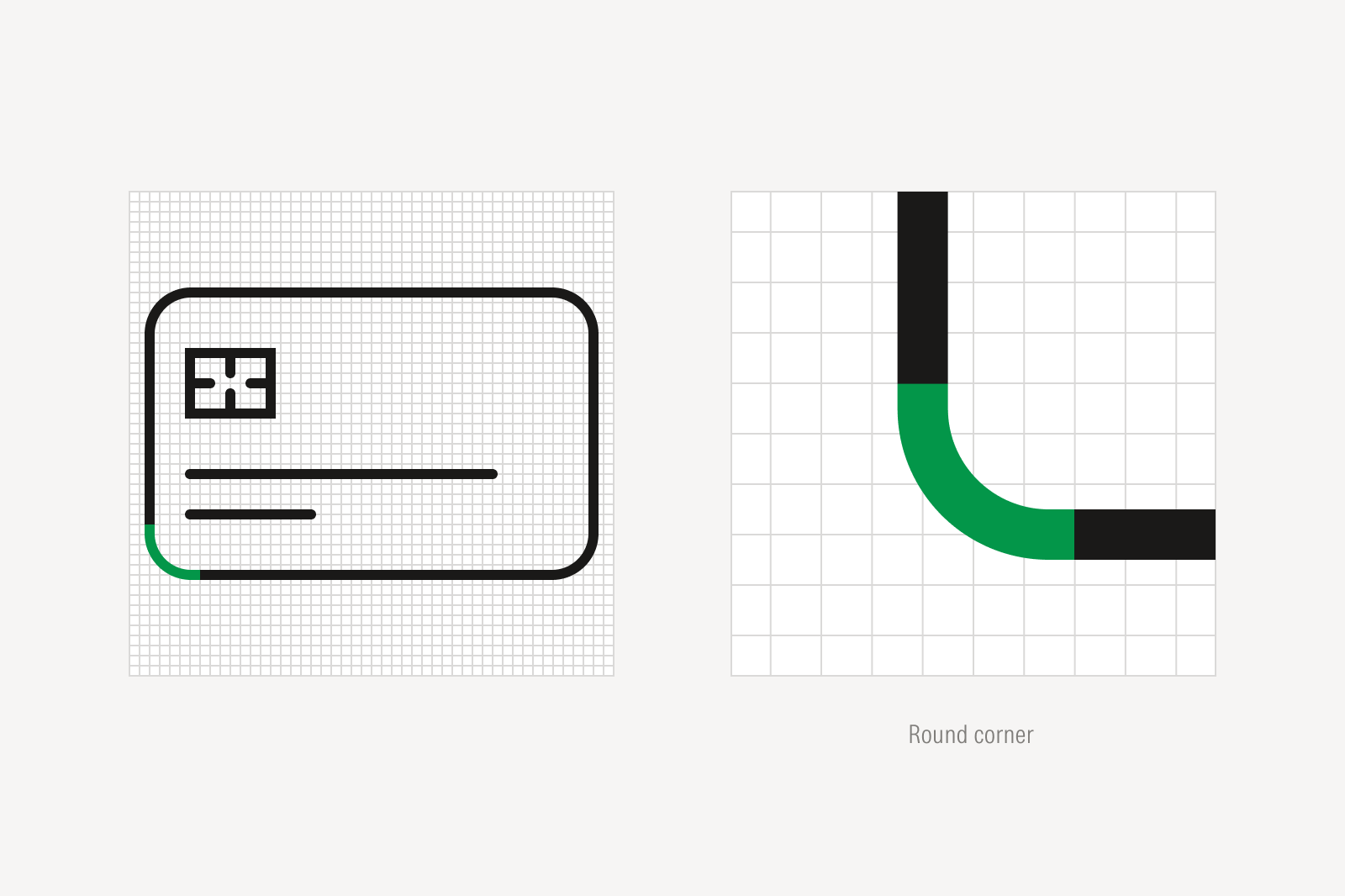
A credit card icon with a chip and text lines, drawn on a grid with its bottom-left corner highlighted in green; and a close-up labeled 'Round corner' showing that corner as a smooth curve where two green-highlighted edges meet.
If an icon is depicting an object with round forms, then draw it with round corners.
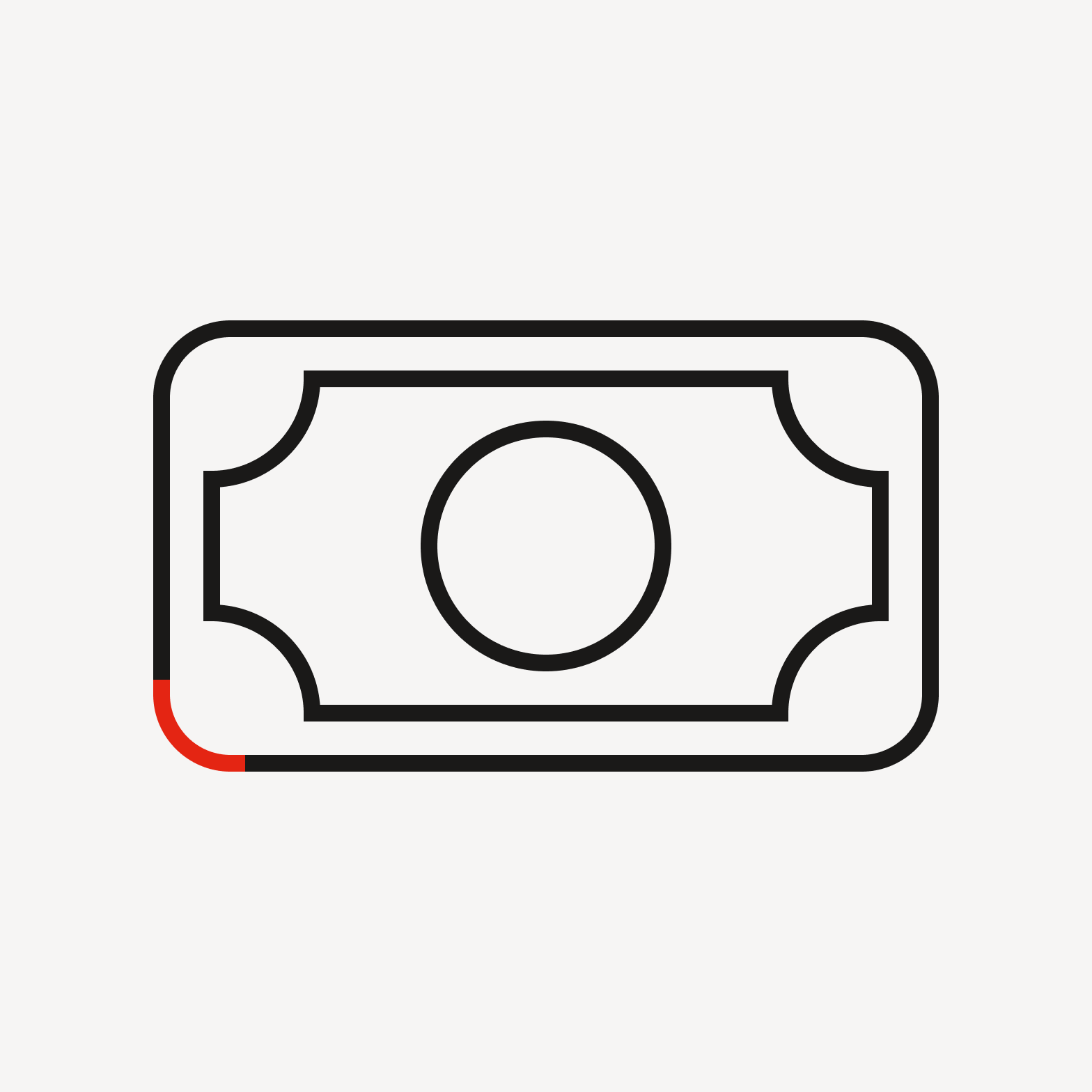
Bank note with round corner.

Avoid drawing round corners when depicting objects that do not have them.
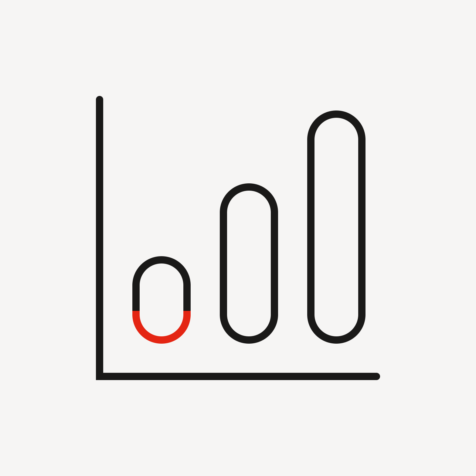
Bar chart with round corner.

Don’t apply round corners for decorative effect.

Angles
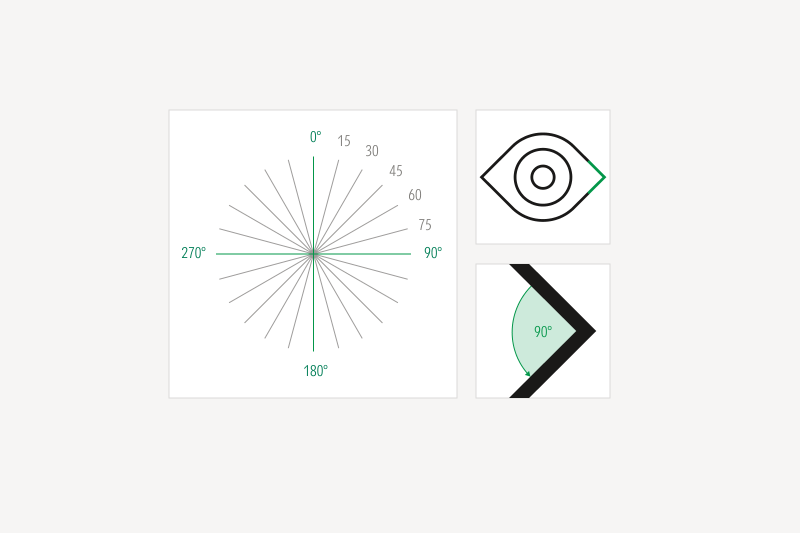
Diagram showing 360 degrees at 15 degree increments with detail view of an icon with a 90 degree corner.
As a general rule, angles are drawn at 15-degree increments. By doing so, visual consistency can be maintained across all icons.
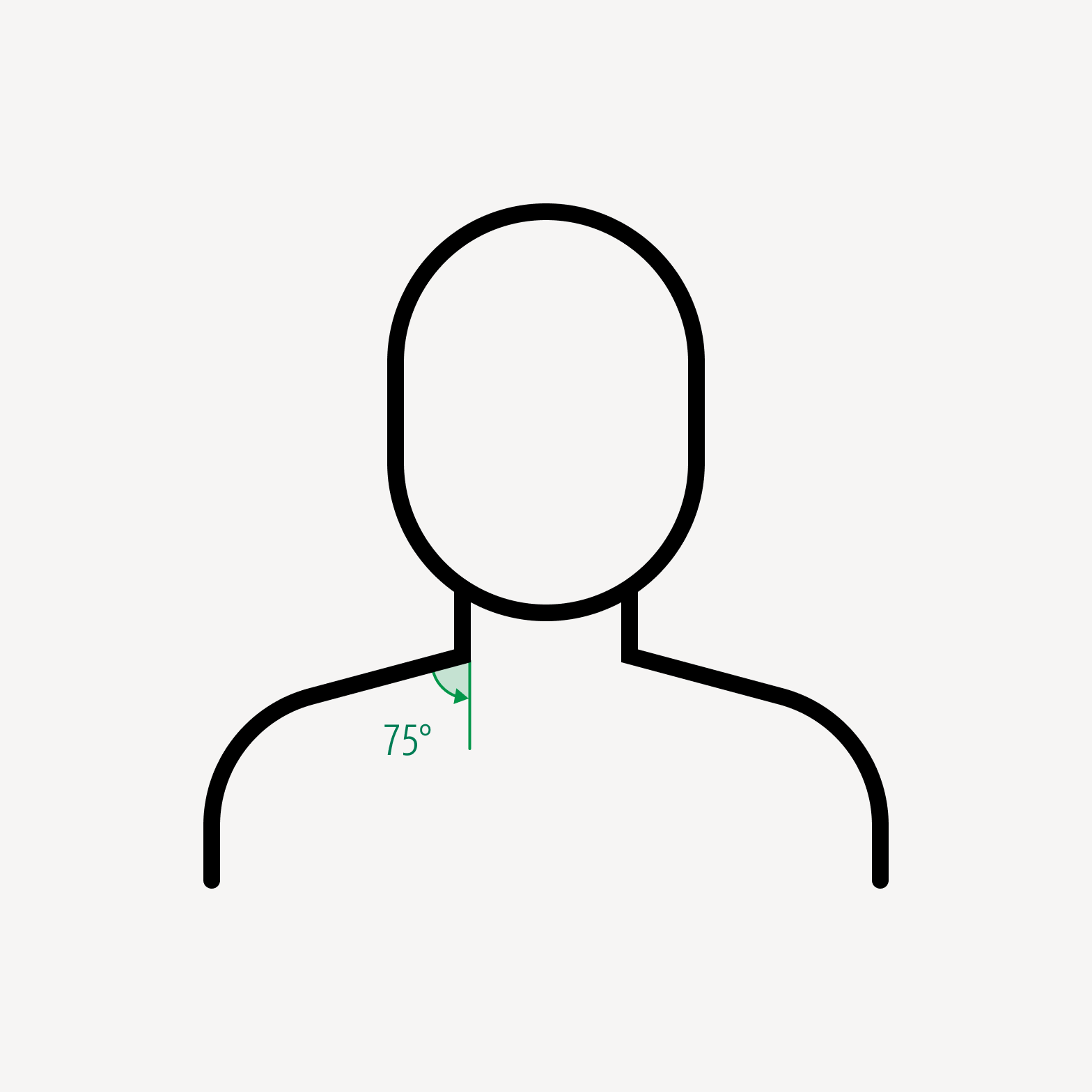
Person with 75 degree corner at neckline.

Do draw angles at 15-degree increments.
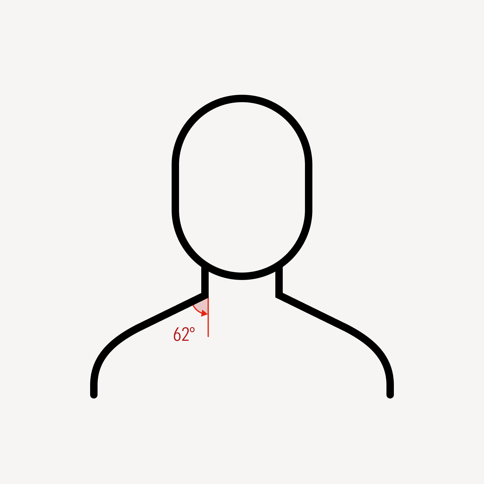
Person icon with 62 degree corner at neckline.

Avoid arbitrary angles.

Radii

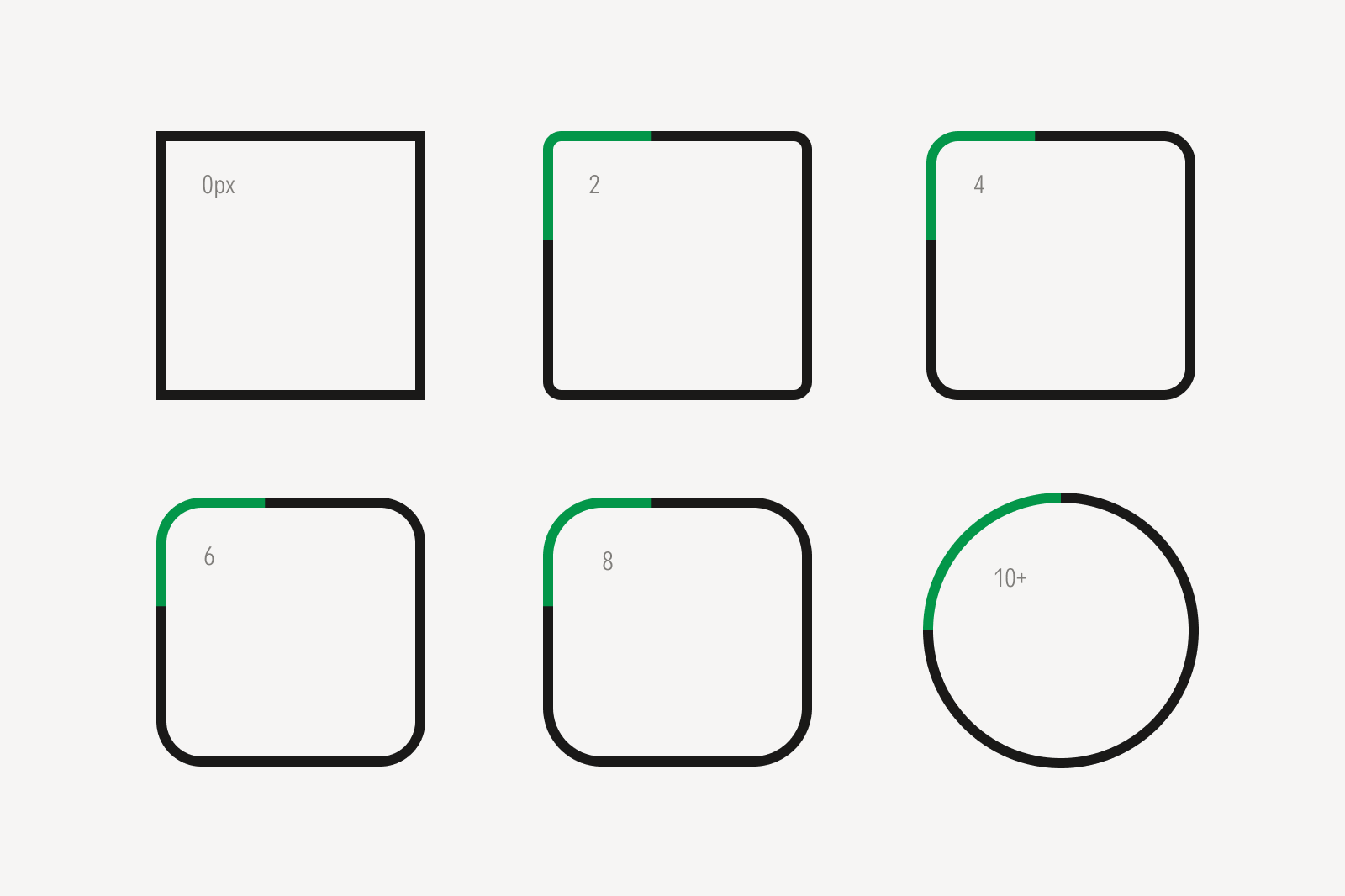
Six shapes showing increasing corner radius, each with its top-left corner highlighted in green: a sharp square labeled 0px, then squares with progressively rounder corners labeled 2, 4, 6, and 8, ending in a full circle labeled 10+.
When drawing round corners, use a radius size from a multiple of 2 px.
The paired speech bubble icon has a round corner radius of 4 px.
The single speech bubble has a round corner radius of 6 px.
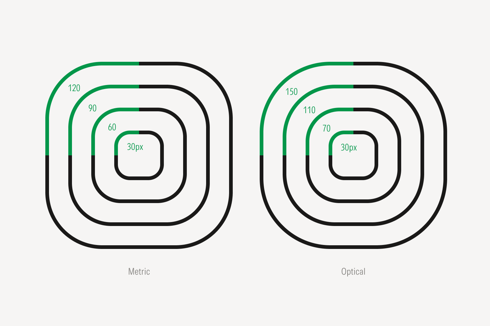
Two diagrams of nested rounded squares, each with concentric radii labeled in green: 'Metric' shows radii of 30, 60, 90, and 120px increasing evenly; 'Optical' shows radii of 30, 70, 110, and 150px, adjusted unevenly for a more natural appearance.
Concentric rounded corners may require optical adjustments to their radii, rather than proportional scaling, for a more natural appearance.

Dots

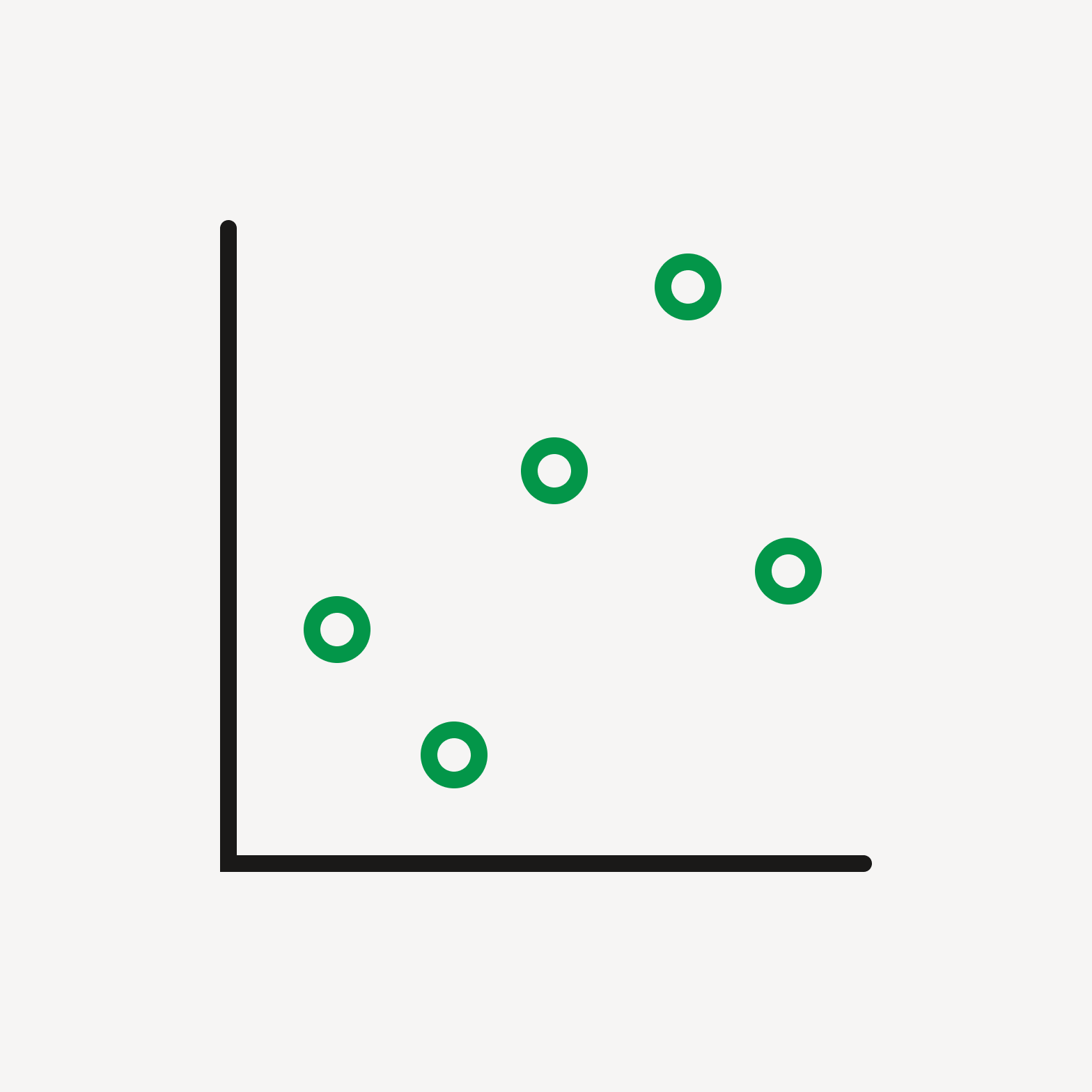
Graph with green outlined dots.

Do use outlined dots to bring visual balance to an icon.

Pig icon with filled green dot for an eye.

Do use filled dots for decorative moments or to retain optical balance within an icon.
Negative Space

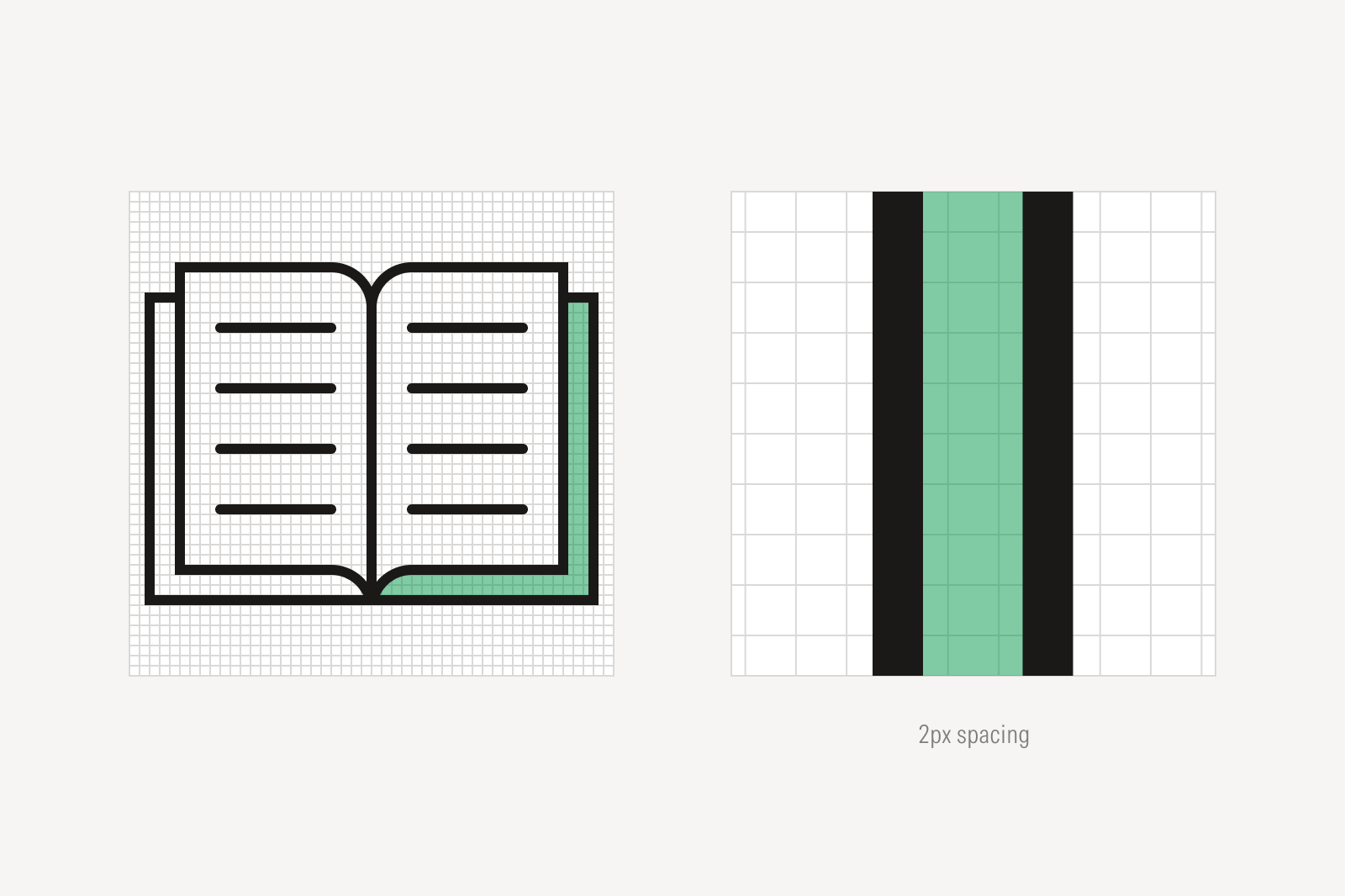
Book icon with detail view of a 2 pixel space between strokes.
Leave a minimum spacing of 2 px between strokes to maintain consistent visual density across all other icons.

Shared Relationships

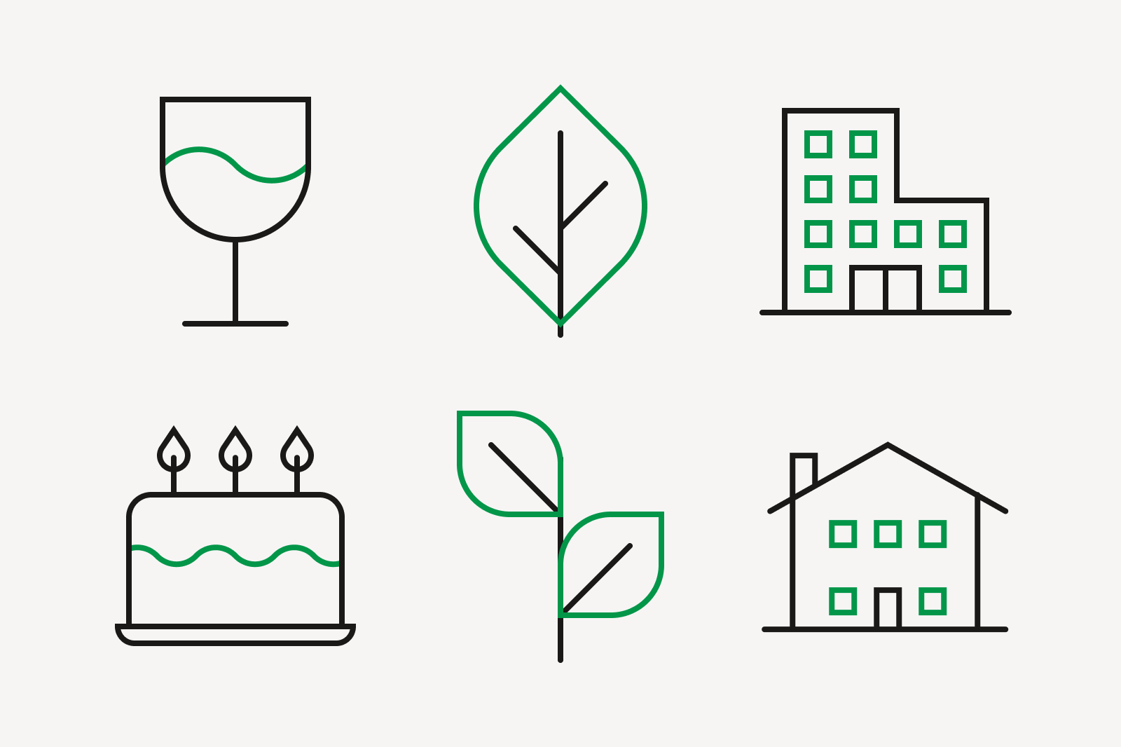
Six icons showing shared visual language: a wine glass and a birthday cake sharing a wavy line motif; a single leaf and a two-leaf plant sharing the same leaf outline; and an office building and a house sharing the same square window pattern.
Replicating curves or forms among icons helps bring consistency to the look and feel across all icons.

Perspective

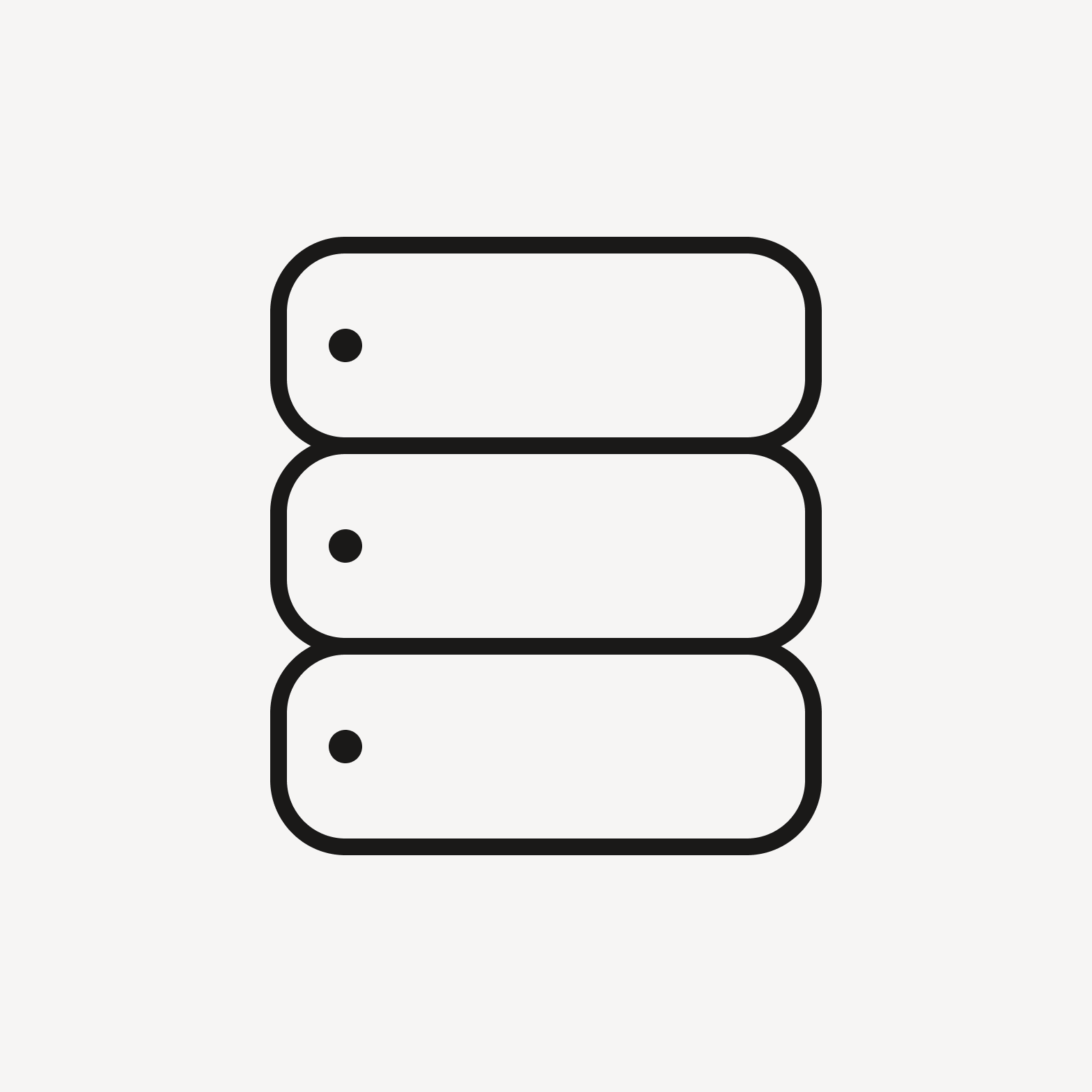
Data server depicted in two dimensions.

Do depict objects on a two-dimensional plane.

Three-dimensional depictions of objects.
Avoid three-dimensional depictions of objects.

Consistency

Outline icon of paired speech bubbles.

Do use the same icon expression throughout the entire icon. See more on Expressions.
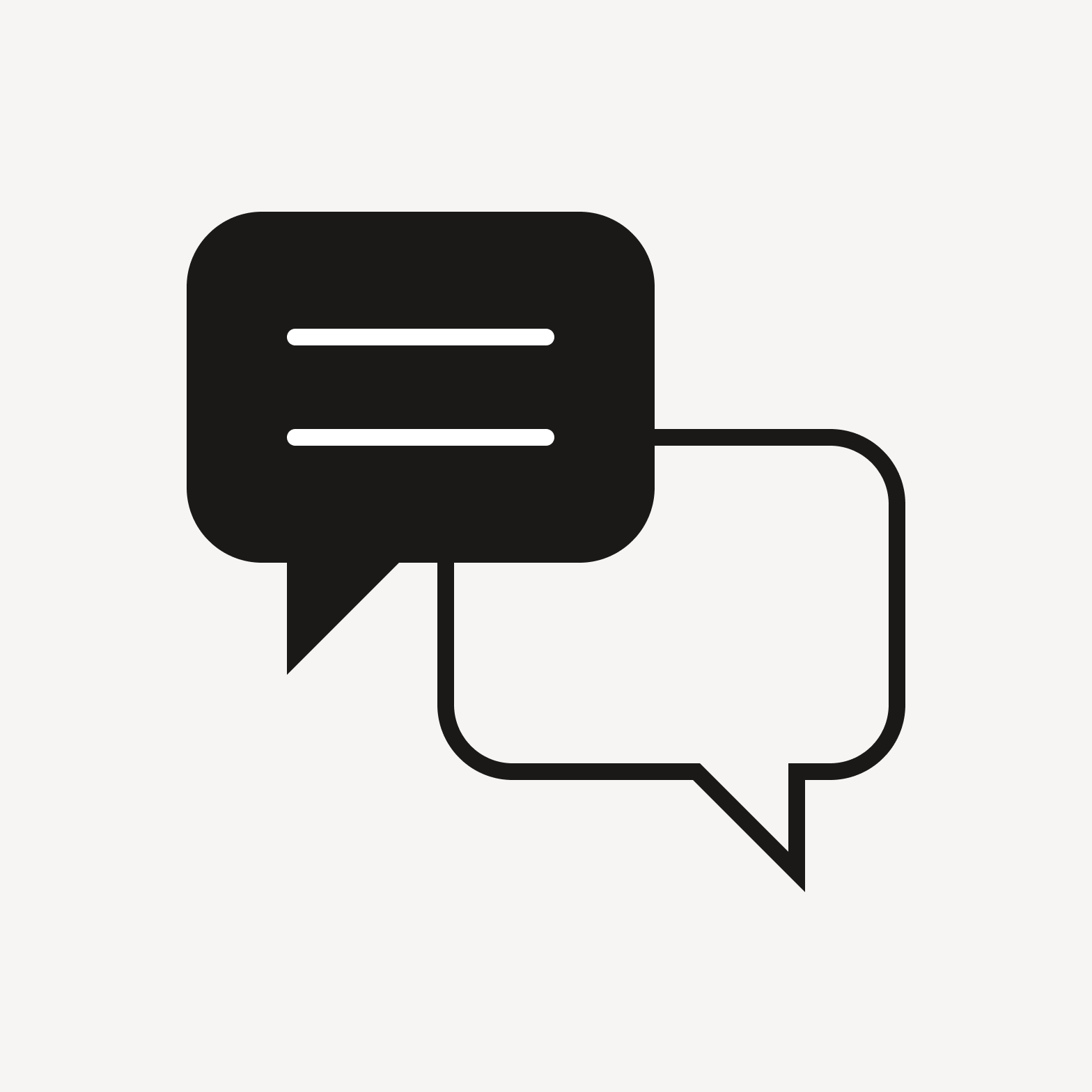
Outline icon of paired speech bubbles with a filled in section.

Don’t mix icon expressions.

Compositing

Enclosure

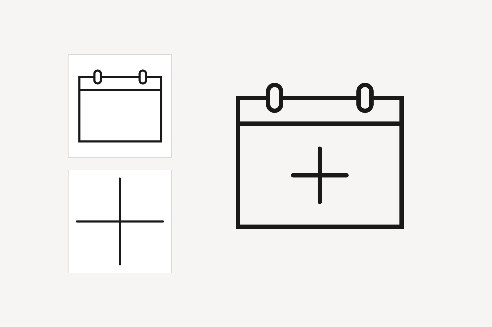
Two icons, a blank calendar and a plus sign, combined into a single icon: a calendar with a plus symbol inside it.
Icons may be combined to add specificity to or change its meaning. The intended metaphor, however, should always strive to remain clear and intuitive.
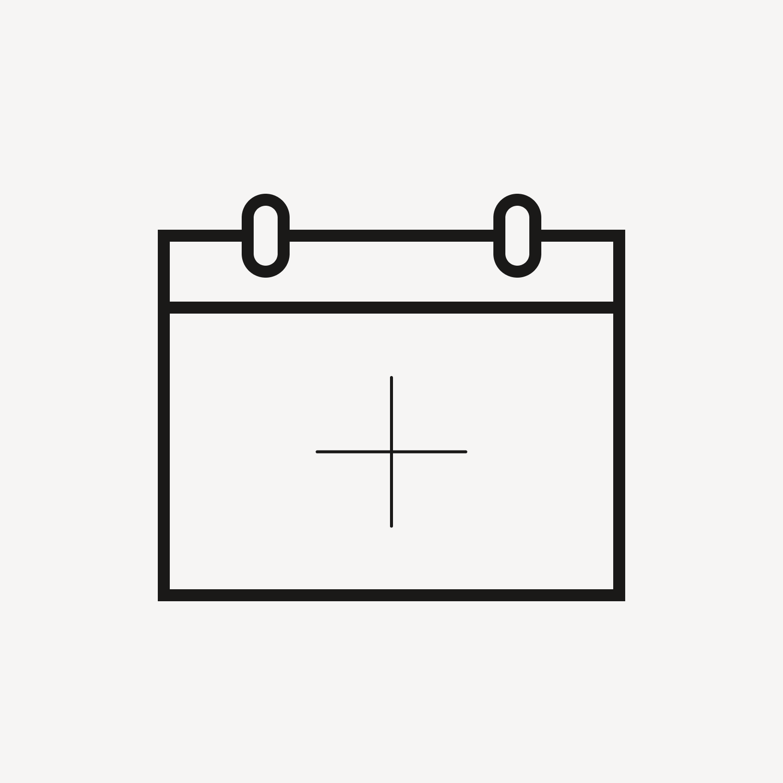
Calendar with plus sign in different stroke weight.

Don’t combine different stroke weights.
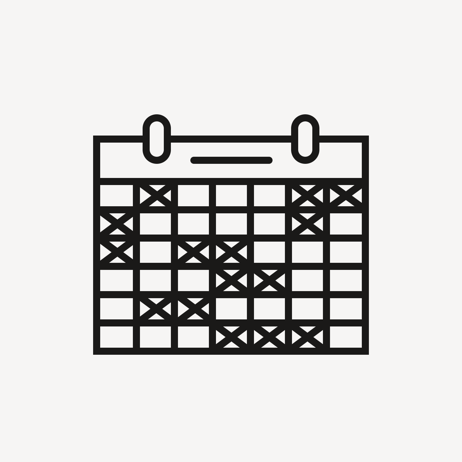
Calendar with crosses in dates.

Avoid overly dense or complicated embellishments.
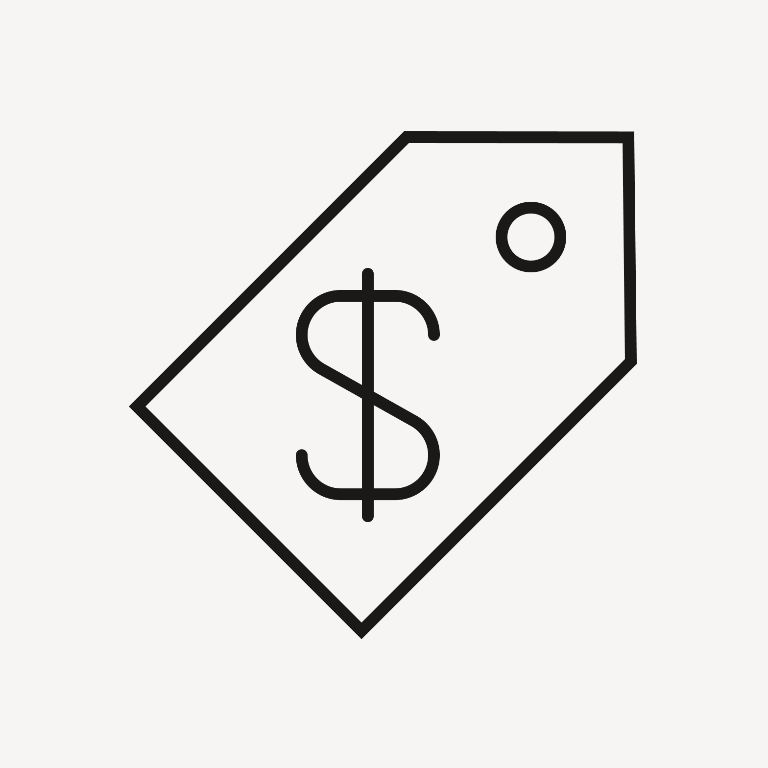
Price tag with drawn dollar symbol.

Do use drawn symbols or glyphs.

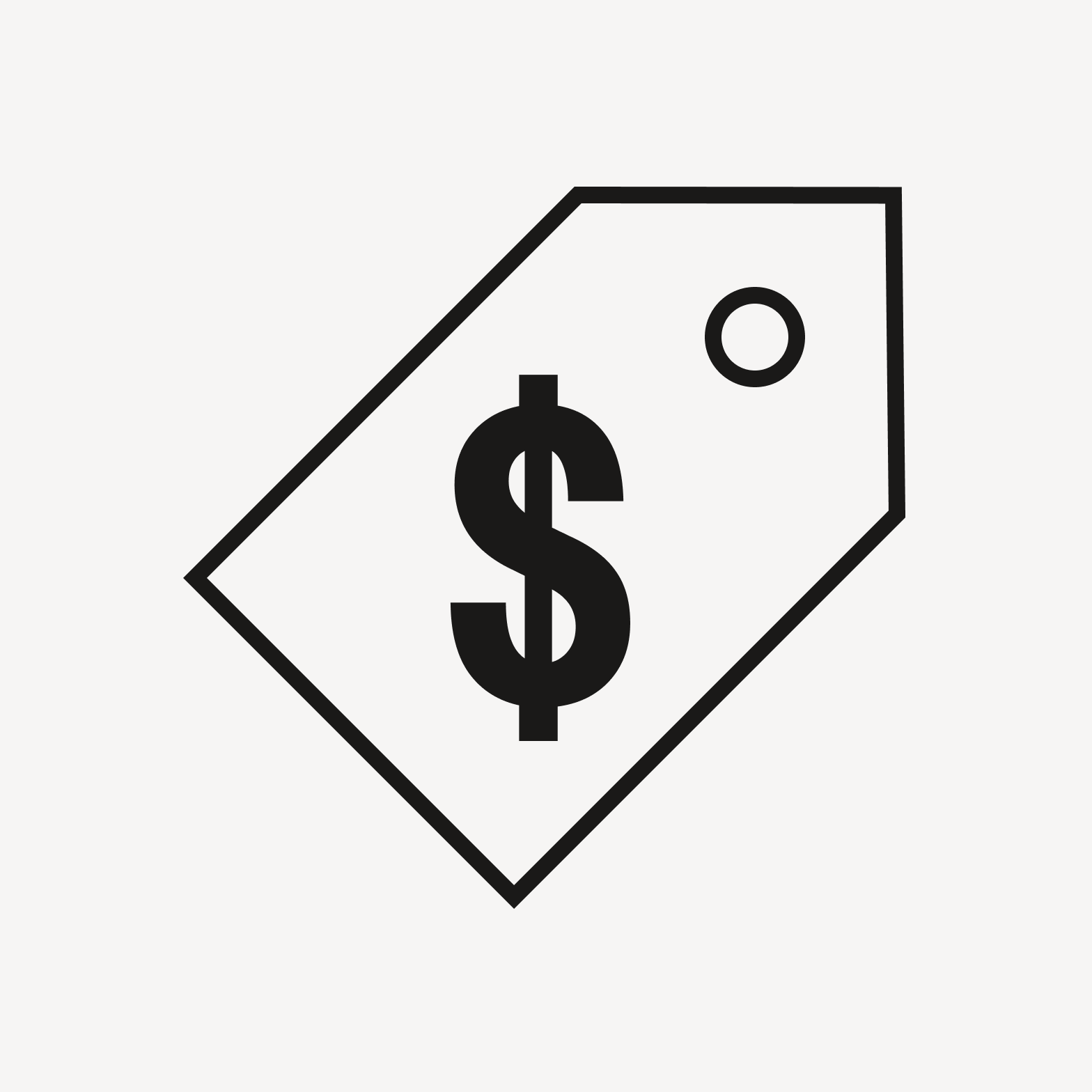
Price tag with font dollar symbol.

Don’t use font symbols or glyphs.

Overlap
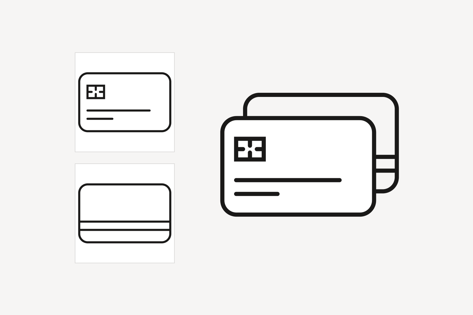
Two icons, a credit card with a chip and text lines, and a plain card, overlapping into a single icon of two stacked cards, drawn without line breaks where they cross.
An icon may be superimposed on one another to show overlap. As a general rule, line breaks are not used.
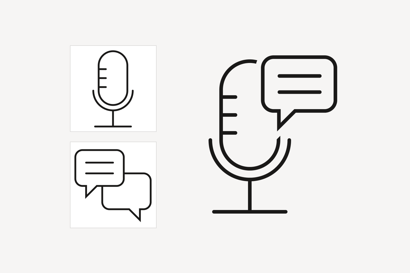
Two icons, a microphone and two overlapping chat bubbles, combined into a single icon of a microphone with a chat bubble overlapping its top, with line breaks where the shapes cross to clarify their boundaries.
Line breaks may be selectively used to clarify the boundaries between two objects and remove ambiguity in meaning. Avoid using breaks for decorative effect.
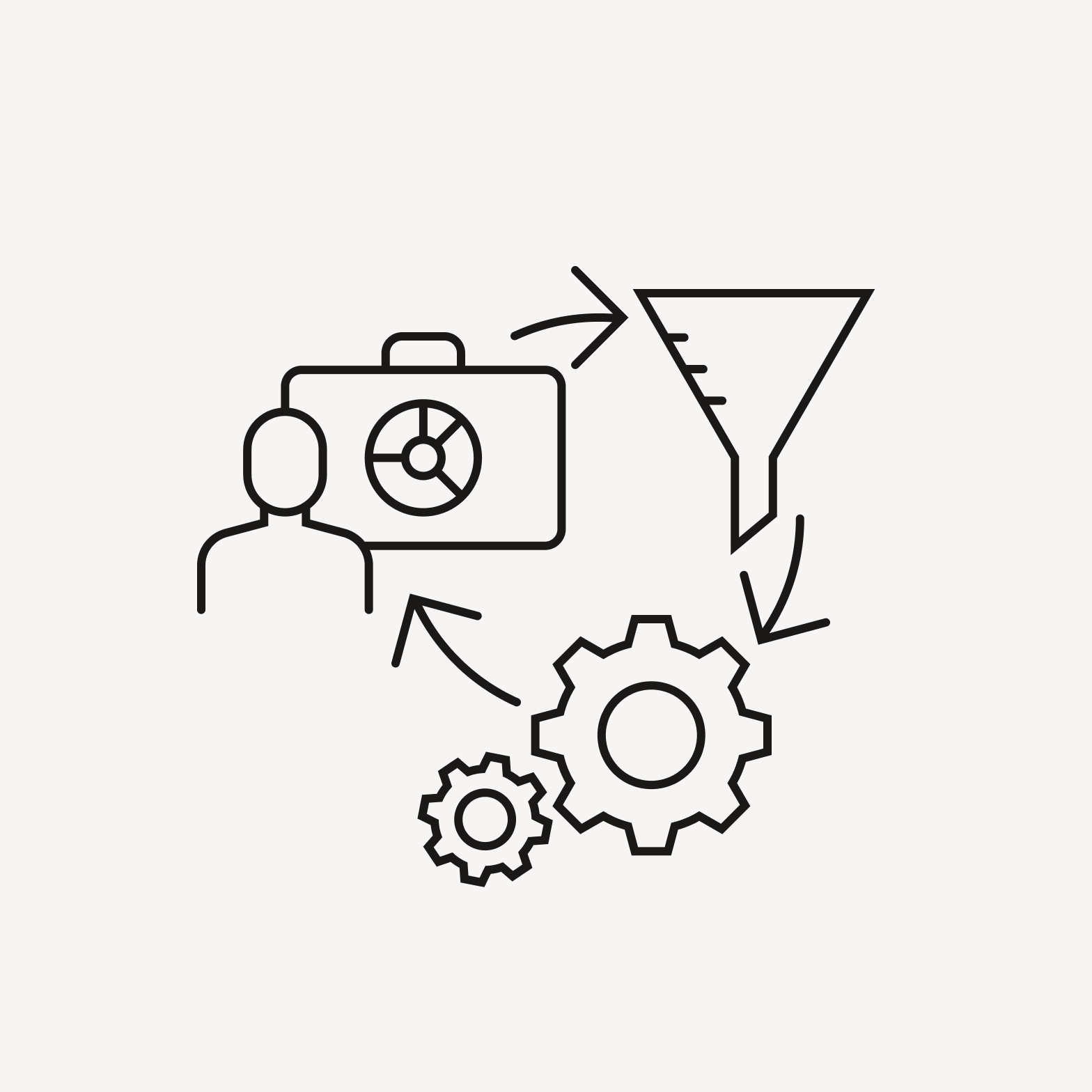
Overly complex composite icon consisting of many individual icons.

Avoid overly complex composites. An icon's metaphor should be simple and understood intuitively.

Connectors
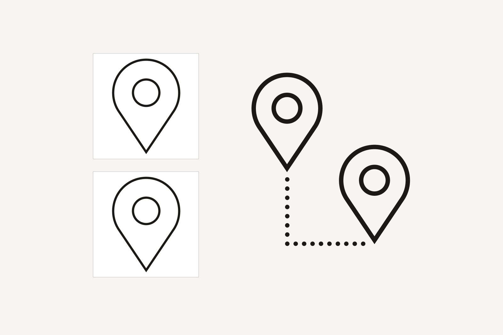
Two identical location pin icons combined with a dotted right-angle line connecting them, showing a relationship between the two points.
Lines connecting icons can help define a relationship between two objects.
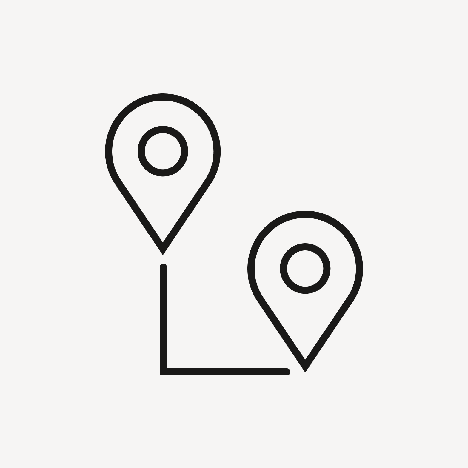
Two location pin icons connected by a right-angle line, with a small gap where the line meets each pin.

Do use breaks between lines and objects.
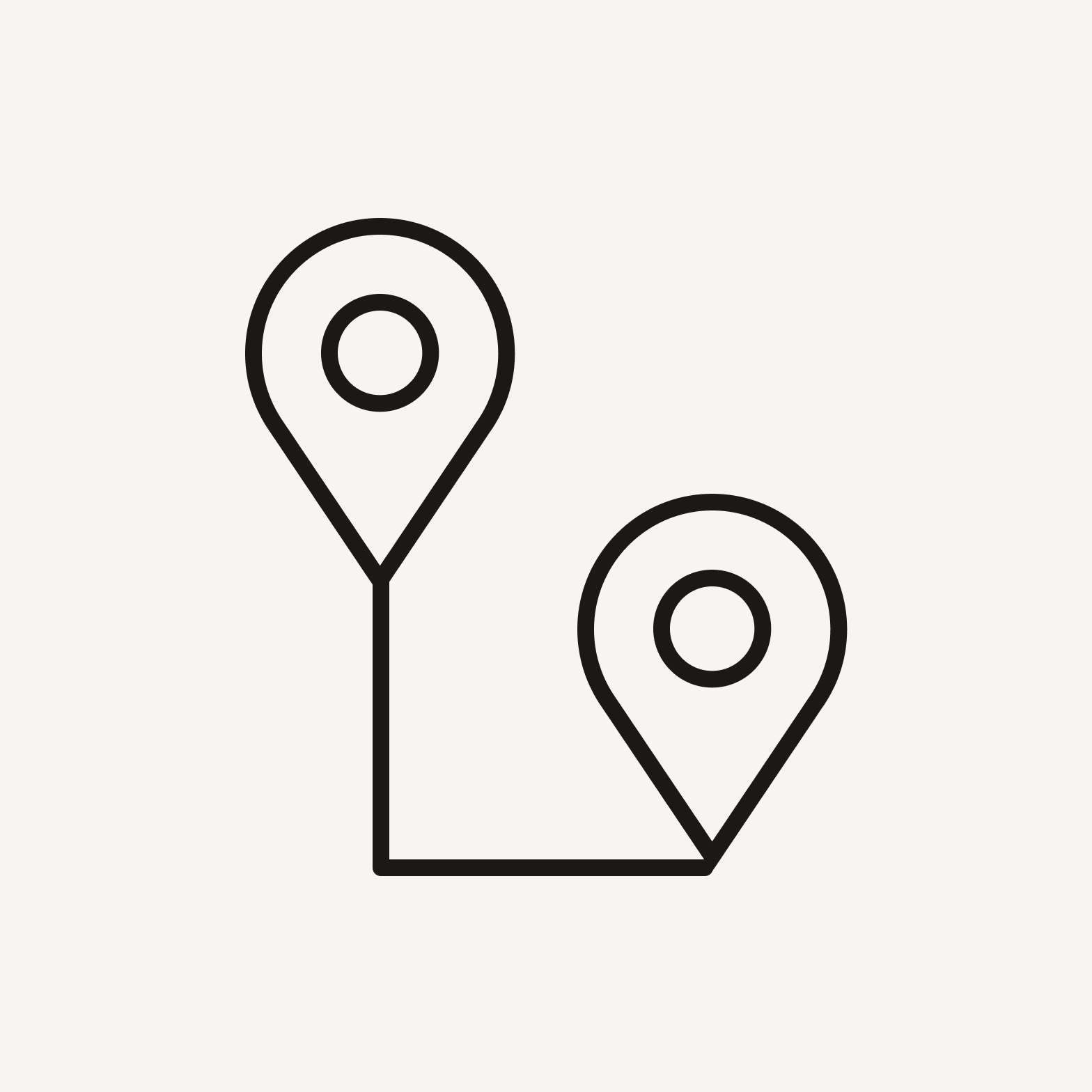
Two location pin icons connected by a right-angle line that touches directly onto each pin, with no gap.

Avoid connecting lines to objects.

Inclusivity

Icons can serve as visual shortcuts. However, shortcuts can sometimes be stereotype-confirming, so we should strive to always find commonality when depicting people, things, ideas, or actions.

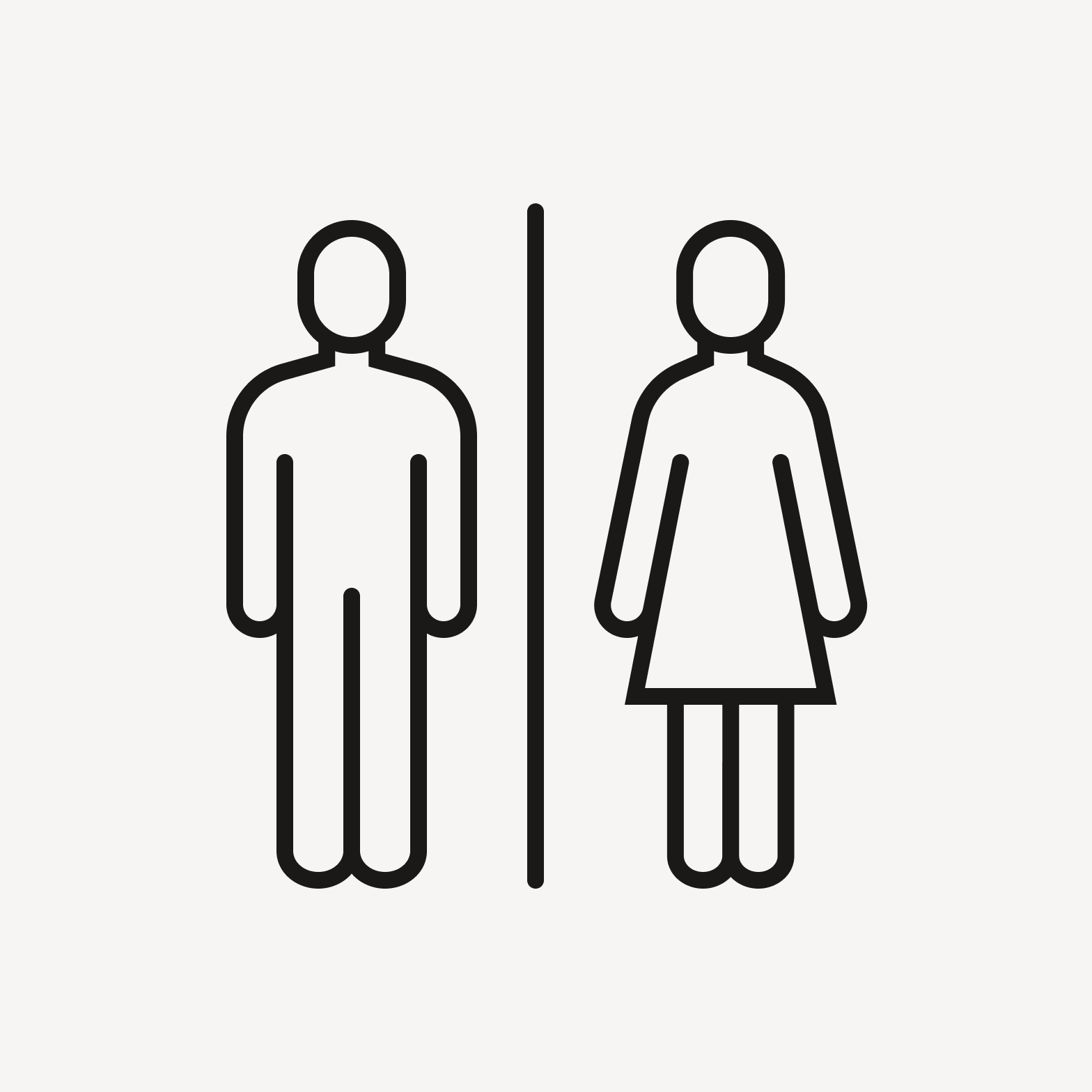
Restroom sign icon showing a male figure and a female figure in a dress, separated by a vertical line.

Be mindful of implicit biases when depicting people, things, or ideas.

Restroom icon depicting a toilet fixture instead of gendered figures.

Look for commonality when choosing people, things, or ideas to depict.